“I have a winter fan from another colour system and it has orange in it but the TCI Winter fans do not. Can you tell me: does orange really work for a Winter? Logic tells me no, but I would like to hear your explanation”
JC
Where is the Winter Orange?
Another interesting question and a fun – and I hope instructive – one to contemplate. Thank you!
When you compare the TCI 12-tone Classic and Corporate colour palettes to the suggestions found in other systems you may see things that look closely related or similar – that is, there may be a significant block of colours present which harmonize, or approach harmony, with the hue, value and chroma disciplines of a given TCI palette – while otherwise there may be some very striking differences. Sometimes these differences are easy to understand/appreciate –for example, we don’t have obviously warm (advancing) and cool (receding) colours in the same tonal group, or highly saturated colour in the “Soft” tones – while other choices are not so obviously intuitive. A recent post regarding the True Winter red was written in response to another excellent reader query along these lines (see ‘When is Red not Red’), so let’s revisit, as always, some basic colour theory and explore the possibility of this elusive unicorn, a “Winter orange”.
There are two central concepts we need to consider here.
The first is the question of what we mean by “harmony” itself. It has been suggested that PCA is a qualitative procedure and that the final result depends on what an individual analysts finds most ‘attractive’; in other words that the results are subjective and while one analyst may decide on one result, another may choose another tone for different reasons. I can’t speak for other systems beyond saying that, like many topics of human interest with no one internationally agreed standard, this is probably one of these things that various schools of thought can and will debate until the end of time. It is fair to say that many things can affect what we think we are seeing: viewing conditions and experience, a learning curve (which is often more of an “unlearning curve”, as the analyst and the client relax into seeing and accepting what is naturally there rather than being swayed by artificial or commercially-conditioned expectations of colour and/or ‘beauty’) and conflicting colour effects external to the analysis (hair dye is a particularly big confounder here), and so on – but what I do know is that when we talk about colour harmony in relation to accurate interpretation of 12-Tone colour theory, we are referencing a concept that has a very specific definition and meaning; one which controls for distracting effects and which strives for a result that is demonstrable, objective and agreed as opposed to a subjective ‘preference’.
The term ‘harmony’ as defined by Kathryn Kalisz (former master Munsell colourist and CEO of Sci\ART Global), is this: “‘harmony = related”, a connection between all parts (hair/skin/eyes) and the colours we surround ourselves with which result in a particularly pleasant ‘experience’ for the viewer. In other words: the closer or more related each hue is in any given arrangement (in terms of the three dimensions of colour: hue, value and chroma), the more satisfying the experience is.
The first core principle that I want you to keep in mind, then, can be summarized like this:
“Natural colour harmony is perceived in the absence of negative optical illusions.”
We perceive harmony when there are more positive than negative ‘effects’ in our field of view. 12-Tone theory as taught by TCI emphasizes the need to elicit and relate these effects to a defined area of colour space, and it is this definition of the parameters that gives the system its precision.
Below is an example of some of the optical illusions we may experience when looking at skin tones on different backgrounds. When looking at the image ask yourself some questions: what are the differences between the cool skin tones as they appear on the cooler blue and the warmer orange background? Where is the round shape fuzzy/clear, darker/lighter? Where does the true colour of the skin tone (seen when viewed on the grey background) alter least – when it appears on the orange or on the blue? Which feels more relaxing to look at–the orange or the blue? Don’t over-think it – just look.

The cool ‘skin’ tone is the same in each example but our perception of it changes depending on the background. This simple demonstration is a familiar example for those with a keen interest in this subject, I am sure, so let’s back it up and expand it with a “real world” example of how these optical illusions appear during PCA. Here is an example from the TCI website of some positive and negative effects:
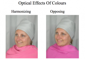
In other words, the superimposition of warm and cool colours gives rise to visual effects which are easily demonstrated. There is no mechanical test for harmony, rather it is detected by the human eye, but everyone has the potential to perceive and understand colour effects in the same phenomenally precise way that they can detect, at a glance, a picture hung a fraction crooked or the most subtle asymmetry.
The Winter Orange
Now let’s return to the idea of a winter ‘orange’ with the second concept we need to consider: the way that colour moves and behaves in nature.
I have said this before and I think that the TCI analysts who attended the recent 12 Tone colour mixing course will agree: to really begin to understand colour you need to mix it yourself.
Keeping in mind the limits of our respective monitors, here’s something I prepared a little earlier, an example of a ‘cool’ yellow and a ‘cool’ red. Both are considered ‘cool’ because they each contain blue, and because of their high chroma (as opposed to the low chroma ‘reds’ and ‘yellows’ of True Summer) both the yellow and the red are found in the in the TCI 12-Tone TW palette.
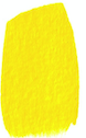
Cool Yellow

Cool Red
Let’s now mix the cool yellow and cool red (as seen above) in gradated proportions so we can see how the resulting colours change and, at some point near the middle, result in a hue which most people would refer to as ‘orange’.
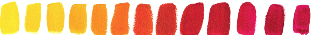
Yellow to Red
And now here comes our key point: would we consider the resulting hues to be ‘cool’ because they are the result of mixing two colours found within a cool tone? It sounds so intuitively “right”, doesn’t it?
Not so fast. What we are really seeing here is an example of how colour moves from cool to warm and from warm to cool via neutrality, from our cool yellow and our cool red via a warm orange in the middle (the intervening examples would be variously placed in cool and warm neutral tones). Let’s experiment, though, with the thought that you *could* mix a cool orange like this. For me, this idea throws up some pretty irreconcilable issues:
1/ How do you determine which is the cool orange? Is it the one with “more” cool yellow or “more” cool red in the mix or the ‘orange’ right in the middle?

Which is the ‘cool’ orange?
2) Having selected our example, how does this stack up against the central test in PCA, the optical effects of colour on human skin? For argument’s sake, let’s choose the middle orange and test the theory using some of the knowledge and skills we have in relation to spotting colour harmony.
 It’s uncomfortable looking at the examples on the right isn’t it? The cooler ‘skin’ tones appear greyer and the surrounding orange seems to shimmer, pixellate, vibrate. On the other hand the warmer ‘skin’ tones on the left remains clear, calm and creamy. On the right you are looking at visually demonstrated disharmony. It is unsettling, like trying to reconcile 2 + 2 with the idea of 5.
For fun and interest, let’s try the same experiment with the other two ‘oranges’ and include a neutral ‘skin’ tone. Again we can see that the least altered ‘skin’ tone is the warm on the left, closely followed by the neutral in the middle, with the cool ‘skin’ tone on the right showing the most disharmony when viewed on each of the ‘orange’ back grounds.

Warm Neutral Cool
We can answer our reader’s question of why no winter orange in TCI 12 Tone palettes, then, by considering and combining these two principles:
First, the human eye assigns colour harmony by observing some fairly straightforward effects, as demonstrated above. Warm colours seem to advance, cool to recede, and when the two are juxtaposed in disharmony the eye experiences this as a sense of unease, flickering, or dissonance. When we test colours in PCA, we are considering them against the warmth, coolness or neutrality of the skin of the person in question and looking for these effects, though we may describe them in more specific ways like “blurring, sallowness, blotchiness, pallor, queasiness” or conversely “bloom, skin clearing, freshening, definition, relief”.
Second, colour naturally flows from cool to warm and through to cool again via neutrality. Although we may sometimes arrive at new colours within a tone by simple mixing, pigment properties vary and the construction of the palettes takes multiple dimensions of colour into account, and it is an oversimplification to say that mixing any two colours of the parent tone will give you another colour of that tone. Rather, colour mixing helps us to demonstrate and understand the principles of colour flow in action (and commercial pigments are never pure, and often contain traces of other colours which can combine in a subtractive manner to give unexpected results. This is a vast field in itself, but you can glimpse the implications when using commercial fabric dyes, where a brown or black is revealed as a composite of granules of (say) red, blue and yellow as it begins to dissolve, and where we often struggle to get the colour or clarity we want when over-dyeing.)
Winter, then, doesn’t have an orange, which is really better thought of as just a very yellowed or warm red. Indeed, another way this question could have been phrased is “If all seasons have reds, yellows, greens and blues, why don’t the cools have an orange?”, but if we think of it as a type of red – as indeed it is, and this is how people thought of it for much of history – then it all makes much more intuitive sense. Remember, too, that True Spring and True Autumn don’t have anything that looks like a fuchsia, which of course is a blued, cool red. (And for those wanting to explore the warm and cool manifestations of red still further, an older blog post, “Where is the orange” addressed the less obvious form that the warm neutral reds take on within the soft autumn palette.)
Orange is frequently used in logos and advertising and given a prominent place in conventional colour wheels, but perhaps a look at the visible spectrum, rendered in different forms, might put its “natural” place in the colour footprint in better perspective. The first image relates colours to wavelengths, the second is a representation of the standard CIE colour chart, and both attempt to represent a physical reality on the page:

Visible Spectrum

CIE Chart
Note that the colour that most English speakers would call “orange” is a relatively small area of both, but that its position near in the very centre of the visible spectrum (as in the first picture) may explain why it feels so “forward” in our vision, and hence is so often used commercially to convey a sense of sunshine, warmth, optimism, immediacy, responsiveness and fun. Conversely, this “stand-out” factor is also exploited for safety vests and traffic cones and barriers and so on (and nature uses it similarly, both as an attention-grabbing highlight and also as a “warning” sign of the unpalatable/poisonous or dangerous. Birds are tetrachromats, and see all the colours we do, and more. Perhaps the ultimate colour theory thought experiment is this: which tones would get ultraviolet and infrared if we could see them too?)
A few further cautionary review points:
First, I have chosen fairly obvious examples of warm vs cool skin tone to make the point, but as we all know human skin is a spectrum in itself, taking in hues, values and degrees of saturation, and the reality is infinitely more nuanced than a couple of illustrative swatches can convey, so please don’t despair if you can’t “see yourself” in these illustrative examples.
Second, remember again that colour has complex dimensionality, and moves from hue to hue as seen in the examples here but also from light to dark and from high to low chroma. Recall as well that the colours we see also involve combinations of reflected wavelengths or in other words, are not always “pure” slices of the visible spectrum. It is important to realize that the architecture of individual tones takes these multiple dimensions into account.
Finally, then, the TCI 12 tone palettes are not built to a simple formula and while colour mixing is key to understanding their theory, the situation is more complex (and interesting) than might first be supposed. Remember, the human eye, skin and natural hair colours that we perceive are the result of only a handful of natural pigments involved in each, and print and digital processes can do a good job of reproducing the spectrum using a very limited range of only three primary hues, so it’s not quite as simple as “mix x and y and you will get z”. In the end, all colour is a wonderful perceptual illusion, and the human eye, comparing and contrasting, remains and will always remain the ultimate judge of the results.
(Please note: there certainly ARE people who can take a saturated orange or red-orange with a dash of black, and look fabulous – but in TCI’s 12-Tone practice we call these people “Bright Springs” :) That said, we’re all free to break out and do whatever we want, especially on Halloween, though we of the cool seasons might struggle with the makeup in this instance …. )
9 replies to “TCI Myth Busters – The Winter Orange”
Those are very clear color mixes! Might I ask about your brand of paint? I’m interested in doing some color mixing. Do you use watercolor, gouache or acrylic?
I don’t think the title of your article matches the content lol. Just kidding, mainly because I had some doubts after reading the article.
Your article helped me a lot, is there any more related content? Thanks! https://accounts.binance.info/sl/register?ref=PORL8W0Z
Your article helped me a lot, is there any more related content? Thanks!
Your point of view caught my eye and was very interesting. Thanks. I have a question for you.
Your point of view caught my eye and was very interesting. Thanks. I have a question for you.
Thanks for sharing. I read many of your blog posts, cool, your blog is very good. https://www.binance.com/join?ref=IHJUI7TF
Your article helped me a lot, is there any more related content? Thanks! https://www.binance.com/fr/register?ref=T7KCZASX
Thank you for your sharing. I am worried that I lack creative ideas. It is your article that makes me full of hope. Thank you. But, I have a question, can you help me? https://accounts.binance.com/register/person?ref=GGYHGRE