A few years ago, I wrote a blog article about the most important parameters in respect of colour and the SciART 12 seasons (see http://truecolour.com.au/main/page_blog.html – The Value of Colour). I’ve been asked to enlarge on this a little more by a reader, who writes: “I’m hearing a lot about ‘TMIT’ – “the most important thing” – and wonder if you could give us a trainers take on this concept?”
Each of the twelve SciART tones contains a collection of colours which are related by three attributes – hue, value and chroma. This relatedness is the reason why the hues found within each of the tones work so well together.
Relatedness = Colour Harmony
Each tone has a predominant colour dimension (PCD). For True Winter and True Summer the PCD is coolness of hue. For True Autumn and True Spring it is warmth, while for each of the Neutral Tones the PCD is the word found in their title – Soft or Bright (chroma), Dark or Light (value).
The P.C.D of each tone is most relevant and most obvious when compared to the each of the other tones. For example, the high value or lightness of the Light Spring and Light Summer tones is most evident when compared to the relatively lower values of all each of the remaining 10 tones. Similarly, the high chroma of the Bright Winter and Bright Spring tone stands out when compared to the relatively lower chroma of each of the remaining tones, and the warmth or coolness of the True tones is best appreciated when compared to the relative neutrality of each of the 8 (neutral) remaining tones. Note that the P.C.D leaps out at us most obviously when we look the tone as a whole, and is most easily seen this way as opposed to examining any one single colour.
In other words, we could say that compared to all the other tones, the Soft Summer and Soft Autumn groups (as a whole) appear lowest in chroma, Bright Spring and Bright Winter groups appear highest in Chroma, Dark Autumn and Dark Winter appear darkest or lowest in value, and so on. These changes between hue, value and chroma are not arbitrary, for they naturally occur as linked phenomena as colour flows from warm to cool and back to warm again within the three dimensions of colour space.
Colour Has Three Dimensions
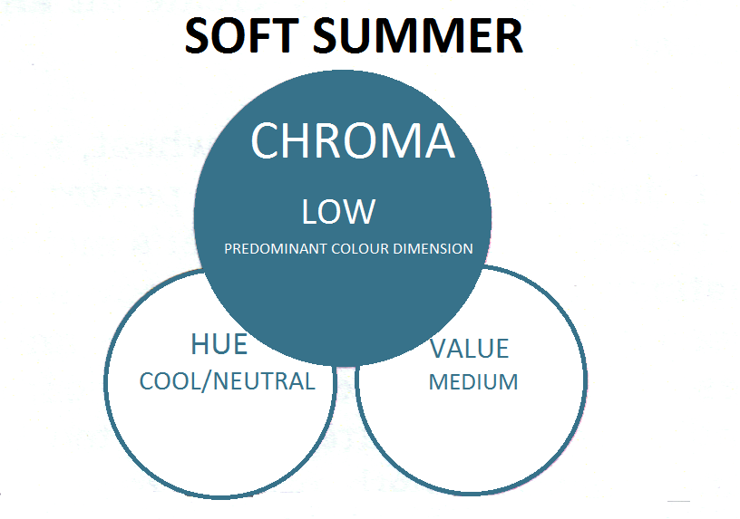
Colour is described in three dimensions – hue, value and chroma. When matching or assessing a colour, no one dimension should be considered in isolation from the other two. For example, if you suit colours from the SciART Soft Summer tone, it would be a mistake to choose a colour just because it is soft or low in chroma. This would not be a good choice because the neutrality and value of the hue are just as important in respect of the tonal dimensions for a Soft Summer individual, and so, because of the way colour behaves, they do not simply wear softer versions of True Summer colours. For those of this season, the hue needs to be neither truly warm nor cool but neutral, the value needs to be medium, and the chroma has to be very low for the colour to work. It all sounds really complicated, but in practice, it doesn’t have to be. This is where an accurate colour palette comes in VERY handy and will help you assess whether a colour fits into your tone, as well as educate your eye in respect of the working limits of the three parameters for your season.
If we wanted to get really picky, we could break it down even further according to the way in which the human eye and brain perceives light.
The Most Important Thing(s) in Order of Importance
1/ CHROMA (brightness vs. softness)
Human beings find a disconnection between the chroma of two or more colours most unsatisfying! In other words, get the chroma right (bright with bright or soft with soft) and you are more than half way there.
2/ HUE (Warm-Cool-Neutral)
Human beings find unrelatedness of hue quite disturbing! If you suit cool tones, stick to True Winter and True Summer, if you suit warmth, run a mile from anything that is remotely cooled. If you suit neutral (a mix of warm and cool) make sure that both are in the mix!
3/ VALUE (Light vs. Dark)
Value is the dimension of colour that humans find the least disturbing when we “get it wrong”.
All that said, we are most satisfied when all three dimensions are in harmony, and we perceive disharmony when any single axis is “off”.


1 replies to “PCA Myth Busters – Predominant Colour Dimension”
Thanks for sharing. I read many of your blog posts, cool, your blog is very good.