
After all the recent focus on Winters, an analyst dropped me a line, figuring that it was time to do a one-eighty: “A Soft Revolution, the PCA equivalent of the Velvet Revolution? … Maybe you’ll consider a blog post about the matter?” she suggested.
And indeed we shall – and the Softs have the numbers on their side, that’s for sure, so here we go.
A bit of background, first. Many, many years ago, long before I came to practice Personal Colour Analysis, I had the time of my young life as the guest of a family in Japan.
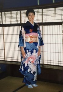
Looking back now, I suspect that this trip was also an early lesson in the beauty to be found in opposite approaches to chroma, and most of it could be picked up with a glance into my new friends’ wardrobes. Wintry extremes of saturation and value could be seen in both the bright colours of young women’s festive formal kimono and in formal menswear and older women’s high formal kimono, but at the other side of the wheel, in the dusty, gentler colours of older women’s visiting kimono and the subtle, cleverly harmonizing choices of many of the young people I saw, I also began to recognise what I now know as the equally sophisticated, strikingly poised tones of Soft Summer and Soft Autumn.

A few articles back, we talked about how we often love things not because they look most like us, but because they don’t. I am a Bright Winter and the drama of this palette feels completely right, but I also love to be surrounded by simple organic shapes, natural forms and desaturated, softer colours. It is an aesthetic related to the Japanese idea of Wabi Sabi, a difficult philosophy to explain in a few words (many have tried) but which we can try to sum up as about valuing the natural, the irregular, the worn, the imperfect, the faded and the effect of time and usage. It is about the extraordinary beauty of what might be termed ordinary, but it’s only ordinary in the sense that nature gives us so much of it that we can take it for granted, and the subtly dimensional colours and organic textures involved are the hardest to reproduce convincingly. If the Brights are festival colours and decorations, fireworks, and the clean, stylised, bright forms of origami, the gentler colours of the Softs could be said to capture this counter-balancing approach (though of course we can take this analogy too far, as many Softs may be drawn to intricacy, formality, architectural shapes, symmetry and engineered precision, as expressed by their own or other palettes). I saw that the same culture can value them both, and everything in between.
Wabi sabi is everywhere in nature, and so are the Softs. In my practice they are the most commonly seen Tones, and there are some pretty straightforward reasons for this preponderance. A qualification: the majority of my own client base to this point is of European ancestry. This is a case of local demographics and then the further self-selection process that clients go through in deciding to have a PCA, but keep in mind that other analysts elsewhere may have a very different perspective on all this – a colleague in South East Asia once reported seeing a lot of clients who turned out to be Winters and Darks, for example. (Analysts don’t – shouldn’t – decide what Tones we’ll see, our clients do, or rather their ancestors do. PCA is the process of working out what the client’s colouring is telling us, but everyone walks in with the answer already there. Our job is to help us both be honest about it.)
Both of the Softs are broad churches. The darker ones may wonder if they’re winters (usually the Summers, who’ve worked out that they’re basically cool but who find that pastels and clean pinks and blues aren’t really their best either) or Darks (often the brown-eyed, darker-haired autumns, who might have found that truly warm colours are just a bit much, often struggling with both Spring and True Autumn colours in their wardrobes). Sometimes the warms come in suspecting they’re cools, and vice versa, and that’s not unusual in PCA by any stretch. Many of them have tried just about everything, their subtle neutral colouring inviting experiment like a buff-coloured canvas, but with most of it feeling a bit brash or off or whatever and without any of it really feeling like it sits exactly right. Or as one exasperated client once put it, “It’s like we’re the Dulux beige of human colouring, the standard spec home decorator stuff that is supposed to go with everything but doesn’t really work with the new couch after all!”
But this sort of experience isn’t limited to the softs – all the Tones can feel like no-one is catering. Soft Autumn and Soft Summer are as defined and varied as any other tone, it’s just that Softs, like other neutral Tones (the majority of us overall), can find it particularly tricky to find the common tonal ground where the assurance and strength in their natural colouring appears to best advantage. They may find it that much harder because they’ve got to get the chroma settings right, and it’s not always obvious or intuitive pre-PCA that the elusive certain something we’re looking for isn’t just about hue but also about the level of saturation – “soft enough to qualify but rich enough to satisfy” as another client has said.
When fashion insists that hair processing and dyes and make-up be used to take natural colouring higher in chroma and contrast, this leap gets even harder, as these options can confuse the issue considerably. Blocks of colour that aren’t harmonious, however subtly, set up tensions for the eye that are hard to resolve. It has been said before, and here we go saying it again: these Tones get misdiagnosed more than anyone else. There’s so many of them out there in the client base that currently uses 12 Tone products, but our retail culture spends a lot of time insisting that they need more colour for drama and kicks when they get maximum impact from a very different school of thought.
It drives me nuts, this idea that you have to turn up the chroma for excitement, to be ‘heard’. In a world where eco-tourism and responsible consumerism are increasingly aspirational goals, this is the group that looks the most awesome in organic dyes and the most sustainable of colour options, and they’re getting “told” by editorial and advertising that they need to be something else. It’s madness, but I guess you can’t sell anyone their natural hair. These Tones look effortless and put-together with their feet eased off the chroma throttle where others just look meh. They don’t merely pull off this understatement, they stand out as looking knowing and real. Anyone in their best Tone looks like a relief, because their native colouring makes sense of the palette.
Australians seem to have a particular affinity with this area of the colour charts, perhaps because so much of our native bush is soft, and the ranges west of our major eastern cities have a soft blue eucalyptus oil haze at a distance (see the paintings of Frederick McCubbin – yes, it really does look just like that).

It feels like home because it is. It’s a palette they’ve always lived in and with, even if they weren’t wearing it and never will, and they “get” it at gut level.
And as suggested for openers, a population base that has lighter or softer hair and eyes tends to have a lot of Softs. The Summer and Autumn types of this neutral group account for a lot of people who aren’t all that dark or light or clear, and if you look at a Munsell tree it becomes clearer why this might be so. The highest chroma versions of the hues cluster at the peak and the outer “skin” of the solid form, while the purely neutral value scale (white to black) is a relatively tight space down the centre.

If we take a green hue as an example we can see that there are relatively fewer high chroma (bright) greens, relative to everything else. There’s a LOT of wiggle room in the gradations between the outermost higher chroma colours and the grey centre, more than any attempt to model it as a 3D space can ever really represent. Within this there is, in turn, a lot of neutral lower-mid-chroma space that avoids the extremes of value. There are simply more lower chroma colours available!

The happy upside of all this is that the Softs have more room to move in colour space than anyone else, though they may not feel this until they get used to using their palette to find harmony as opposed to exact matches. Expanding on these palettes is relatively easy – there is more gradation around their colours, because while high chroma probes limits, the combination of lower chroma and neutrality gives access to a swathe of middle ground. Too warm for True Summer, not saturated enough for the neutral Winters, not doing it for Light Summer – Soft Summers can grab it all and rock it. Too cool for True Autumn or True Spring, not Saturated enough for the Darks, not clear enough for the springs – over to you, Soft Autumn. It sounds like compromise but it isn’t, it’s just how it is. These Tones stay away from all the usual extremes, but this neutral moderation gives the palettes a rich and blended complexity and what’s more, a lot of them can take it pretty close to several of these boundaries without looking out of place. They are NOT miscellaneous, however, not at all. They have definite requirements of hue, chroma and value (this is the instinct behind our Soft Summer client’s complaint about not matching the sofa), and they reward the same careful attention to their palettes as do all the other tones (the big trap for Softs is in thinking that they can do everyone else’s fashion neutrals because these by definition tend lower chroma than accents), but there is still this sense of an easy versatility.
I sometimes get asked whether these two tones could be subdivided further. I’m not sure where this question is coming from, beyond the usual tendency of different people to like wearing their palette different ways. Sometimes it’s counterintuitive – lighter haired softs have expressed preferences for both the lightest and darkest reaches of their palette. Some Soft Summers think of themselves as “Dark Summer” – deeper, twice-muted, while some Soft Autumns see themselves as “Gentle Autumn”, with their palette (relatively speaking) also the most muted – and lightest – of the autumn trio, but both are more interesting than that IMHO and come very close together in some areas of the palette. That said, one or the other version of a given colour will always be better for cool neutral, and the other for warm neutral.
If I cite these palettes often in this blog series, then, it’s because they are so often seen and perhaps a bit more likely to bring up questions as a result. But I hope readers will forgive me if I admit I also have a soft spot for Softs – I live with three of them: both palettes, two species.
6 replies to “The Velvet Revolution/Wabi Sabi”
Maximize Water Efficiency with Bwer Pipes’ Irrigation Solutions: At Bwer Pipes, we understand the importance of water conservation in Iraqi agriculture. That’s why our irrigation systems minimize water wastage while delivering precise hydration to your crops. Experience the difference with Bwer Pipes. Visit Bwer Pipes
Baddiehub I truly appreciate your technique of writing a blog. I added it to my bookmark site list and will
Puraburn I’m often to blogging and i really appreciate your content. The article has actually peaks my interest. I’m going to bookmark your web site and maintain checking for brand spanking new information.
Can you be more specific about the content of your article? After reading it, I still have some doubts. Hope you can help me. https://www.binance.info/ro/register?ref=V3MG69RO
Your point of view caught my eye and was very interesting. Thanks. I have a question for you.
Thank you for your sharing. I am worried that I lack creative ideas. It is your article that makes me full of hope. Thank you. But, I have a question, can you help me? https://www.binance.com/register?ref=IHJUI7TF