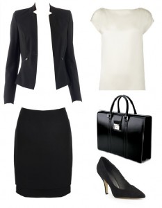
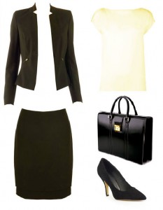
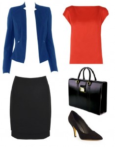
Of all the 12-Tones, Springs are the most challenging to “corporatize”. Perhaps it is because “Spring” is, at its essence, so far removed from the corporate brief that it is hard to comprehend a serious side to this effervescent tone. So just how do we turn a Bright Spring (BSp) into something remotely resembling “corporate” sobriety?
The original TW monochrome from the beginning of the series:
12-Tone Bright Spring monochrome morph:
Black is the absence or absorption of all light, and of all the spring tones BSp reflects back the most wavelengths and outshines all other tones with its brilliance. So how do we brighten up the BSp black? By adding a shot of brilliant yellow, of course! The darkest hue of the 12-Tone Corporate (4.5) and Classic (2.5) Bright Spring palettes is both lighter and brighter than all the Winter blacks. When compared we can see the warmth and brilliance.
The 12-Tone BSp will always look fresher in a bright white shirt with a good dollop of yellow added. Not warm, not cool, but neutral-warm, the BSp ‘white’ is lighter in value and cooler in hue than the True Spring “cream”. 1.1 on the Classic fan is slightly darker, with 1.1 on the Corporate being the more traditional colour worn in the office environment.
You don’t have to wear your palette’s most distinctively Bright Spring brights. You can go neutral, with your navies, darker tones, and greys, and you can use your more “traditional” accent colours (the greens, the orange reds) if the mood needs to be more “traditional”. But this risks overlooking some very interesting options, colours which can look fashion-forward and sophisticated and convey a sense of innovation, flair and wit when worn by you, the person for whom they are intended. Below we have added some accent colours for a tonal lift: Jacket Corporate 6.6, top Corporate 7.2, skirt Corporate 4.4.
12-Tone Bright Spring accent and fashion neutral morph:
Wearing a tone too low in chroma or too dark makes our bright, warm, neutral Spring manager look and feel dull, although it must be emphasized that the same colours would be completely at ease and credible on a soft or dark season. Our personal accent colours, on the other hand, enhance our personal tone, and convey a sense of the right person in the right role rather than someone “dressing the part”, though those unfamiliar with PCA might not be able to say just why this impression is so strong.
The paradox, then, is that a Bright Season will strike us as most competent and commanding when they defy the “rules” and enjoy their personal best colours. Jacket colour same as above, t-shirt Corporate 1.7, shell top Corporate 2.6, dress Classic 3.1, skirt Classic 2.3.
Scarf by Liberty of London
12-Tone bright Spring Look Book by Mira


4 replies to “12-Tone Corporate Women and Beyond Series -Bright Spring”
Your article helped me a lot, is there any more related content? Thanks!
Your article helped me a lot, is there any more related content? Thanks!
I don’t think the title of your article matches the content lol. Just kidding, mainly because I had some doubts after reading the article.
Can you be more specific about the content of your article? After reading it, I still have some doubts. Hope you can help me.